


Summary
- Roku’s redesign trims menus and spotlights preferred apps, keeping the layout familiar.
- AI Quick Access and a collapsed menu should put your frequently used apps first.
- However, promoted recommendations still seem likely to dominate and clutter the home screen.
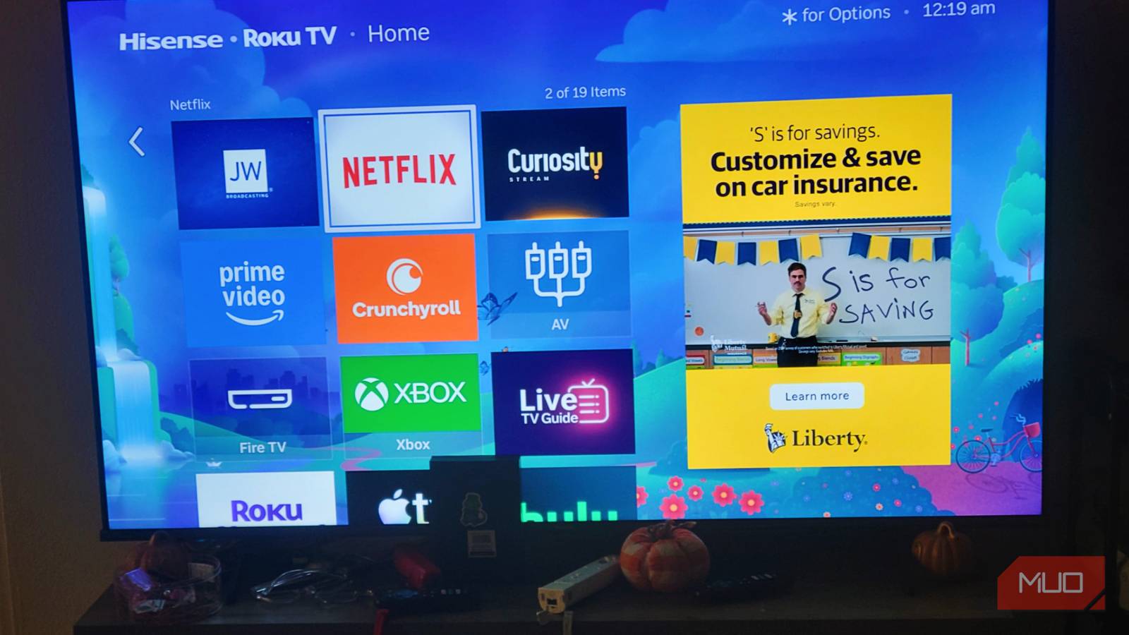
Unlike many smart TV interfaces that bury apps beneath layers of recommendations and advertisements, Roku has traditionally kept things fairly straightforward, making it a genuinely great smart TV interface. That’s why Roku’s newly announced home screen redesign immediately caught my attention. The company says the update will reduce clutter and make navigation easier, but after looking over the changes, I’m not fully convinced the experience will actually feel simpler.
Don’t Skip These Roku TV and Streaming Stick Settings
Boost the performance of your Roku device with these simple settings tweaks.
What you want when you want it
Your preferred apps in the spotlight

At its core, the new home screen interface is all about simplifying how you access your content. And Roku has been one of the best smart TV interfaces for a while. However, according to a new announcement post, the redesigned interface introduces a more streamlined navigation system, updated content discovery sections, and quicker access to features users care about most. Now, visually the new layout does look cleaner. Overall the menus appear less cramped and certain shortcuts have been reorganized. It doesn’t dramatically change things, so the experience should be familiar enough for people who use their Roku often.
This is important because, over the past several years, I feel like smart TV interfaces have become more and more complex. We usually have to jump through several hoops to open the apps we want. However, this new Roku interface is supposed to use AI to highlight the apps we actually want to see through a Quick Access menu. For users like me, that means I’ll be able to easily access and stream from my favorite home media server, or load up my guilty pleasures on Netflix more easily. There’s also a new “collapsed” menu, which is supposed to help keep the apps and other media front and center, too, and you should still be able to customize the Roku home screen further — though exact details on that weren’t shared in the announcement post.
Again, these changes sound like wins on paper. However, it is the actual usage of these new features, as well as some of the other components that Roku is introducing that leave me skeptical.
Trusting AI is iffy
More recommended content does not equal less clutter

The problem is that Roku’s redesign still seems heavily focused on content promotion rather than true simplicity. The company talks about reducing clutter, but much of the visible space on modern streaming home screens is still dedicated to recommendations and sponsored placements instead of the apps users actually open every day.
For many people, the ideal smart TV interface is still incredibly basic: turn on the TV, open Netflix, YouTube, Hulu, or Plex, and start watching. Anything beyond that is often just unnecessary noise. A cleaner arrangement of menus doesn’t necessarily change that experience if promotional rows and suggested content will still dominate the screen.
There’s also all the new discovery tools that are being baked into the new home screen, starting with the Top Picks For You, which appears to be pinned to the top of the home screen. Combine that with all the new mood and genre recommendations that Roku highlighted, and I’m genuinely not sure how this home screen is meant to focus me on the content I want. It more seems like it is focused on finding me the content that Roku’s AI thinks I want.
Of course, it’s important to note that I haven’t tried out the new home screen for myself. However, I am intrigued to give it a whirl once the update hits my system. The new home screen is already rolling out to users of Roku devices, so you can check your Roku for updates now to see if a new one is available.
Hopefully Roku has hit the ball out of the park, as it claims it has. However, I’ll continue to hold my praise until I see just how much these new promotional recommendations the company is highlighting actually affect my use of the new design.