Key Takeaways
- You can easily create custom Spotify playlist artwork using a combination of text, images, backgrounds, and stickers.
- Always try to let the style and mood of your playlist inspire your custom cover art.
- Less is more, so avoid overcrowding your cover art with too many elements for a cleaner look.
Creating and curating Spotify playlists can be great fun, and I have spent hours refining playlists. However, the cover art that accompanies your playlists has always been a little underwhelming, with Spotify just using the artwork from four of the songs featured. That is, until now.
Now, you can create custom artwork for all of your Spotify playlists. With a variety of background colors and gradients, text overlays, stickers, and effects to choose from. This means that you can put the final flourish onto every Spotify playlist that you create.
How to Create Custom Artwork for Your Spotify Playlists
It’s extremely easy to start creating custom artwork for your Spotify playlists. The tricky part is understanding the tool so that you can make the most of it (and get the best results).
To create custom artwork for a Spotify playlist, first, either navigate to a playlist you have already created, or create one from scratch. Then, tap the hamburger menu (three vertical dots) to open the context menu, then tap Create cover art > Create cover art. The feature is in beta, so you may not see it in your app yet.
If you have access to the feature, you’ll see some simple cover art with the name of the playlist, plus a load of options underneath it. The main options are Text, Image, Background, and Stickers.
- Text lets you add the text that will appear on your artwork. You can change the placement, style, color, and effects.
- Image lets you add an image to use on the playlist. You can change the placement and add a mask and/or effects.
- Background lets you change the colors, adding or removing colors, and changing the gradient.
- Stickers lets you add one or more stickers. You can change the size, positioning, and whether it’s in front of or behind other layers.
The key is to experiment with all the options available, as combining all of the above can lead to some satisfying results. I did just that and created some satisfying custom artwork. Albeit, all of which had to match Spotify’s aesthetic, which it calls Spotify Mix.
It should be noted that you can even create custom cover art for playlists created using Spotify’s AI playlist tool.
How to Get Good Results From Spotify’s Artwork Feature
To write this article, I chose four of my Spotify playlists to create custom artwork for, and here’s what I learned…
Let the style or mood of your playlist inspire your cover art. This may sound obvious to some, but think about what event your playlist will be played at, or what mood it’s designed to create. For me, this was most clear with my “Halloween Party” playlists packed full of spooky tunes. Lashings of purple and black dominate, with stickers for fire and a spooky character added.
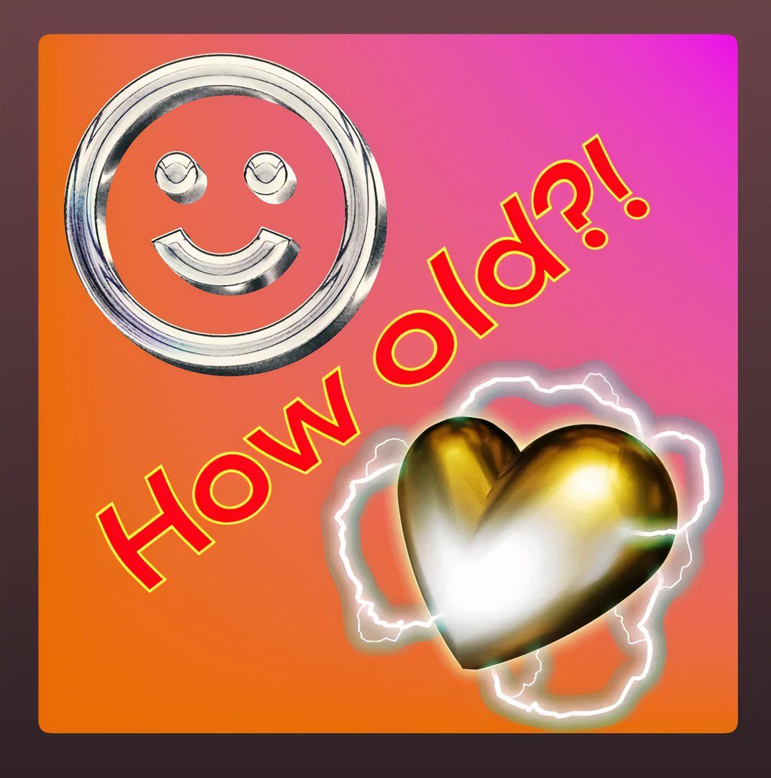
There currently aren’t enough stickers to choose from, with only 40 different stickers available. This simply isn’t enough to cover the wide range of genres, moods, activities, and events you may be creating playlists for. This became clear when I was creating the cover art for my “Birthday Party” playlist celebrating two people’s birthdays. The names of decades or even individual years would have been welcome.
Sometimes, less is more, so avoid adding too many elements. Your instinct may be to cram a load of different elements into your cover art, but actually, depending on the subject of the playlist, fewer elements could work better. The best example of that is the cover art for my “Road Trip” playlist, with a gray background suggesting a road, and two cars traversing the name of the playlist as a sphere.
Look at other people’s playlist covers for inspiration. You can start with Spotify’s own playlists that it creates, as they follow the same aesthetic. There are also some good examples in this post on the Spotify Newsroom. I really am not happy with the cover art I created for my “Christmas Hits” playlist, but have included it below to provide a bad example of custom cover art.
Why I Love Creating Custom Artwork for Spotify Playlists
While Spotify’s custom cover art creator isn’t going to change your world, it is a lot of fun. In fact, I am personally finding it quite addictive, and I will definitely create custom cover art for my remaining playlists over the next few days and weeks.
Given that you’ve created these unique playlists from scratch, and potentially spent hours tweaking them to suit a mood or to soundtrack an event, creating the cover art for them feels like the perfect endpoint. And it’s a great way to flex your creative muscles too.


